
Are your website visitors leaving before taking action? Learn the essential elements that make a website easy to use, and see how some simple changes could be the key to unlocking more sales.
We’ve all been there…
You’re excited to buy something from that store everyone’s been talking about. Credit card in hand, ready to go – but instead of an easy purchase, you hit wall after wall of frustration. The navigation is confusing, buttons are playing hide and seek, links are broken, and don’t even get me started on trying to read the text on your phone!
What started as excitement quickly turns into annoyance. So what do you do? You leave and buy from somewhere else.
If you think this doesn’t apply to you because your customers don’t use shopping carts, think again. According to UserGuiding, 88% of website users won’t return after a bad experience.
Poor user experience isn’t just annoying—it’s expensive.
“On the Internet, the competition is always just one click away, so if you frustrate users they’ll head somewhere else.”
— Steve Krug, Author & Web Usability Expert
What Does User-Friendly Design Mean?
You know what I love? When things just work without making me think too hard. That’s exactly what user-friendly design is all about – creating a website experience that feels effortless and natural.
Your website should be so intuitive that visitors can focus on deciding to book your services instead of figuring out how to navigate your site!
“Design isn’t just what it looks like and feels like. Design is how it works.”
— Steve Jobs, Co-founder of Apple
What Makes a Website “User-Friendly?”
1. Your Website is Scannable
There has never been a time where information has been as accessible as it is today. That accessibility comes at a cost though. Our brains are constantly sorting through information – in fact, we discard millions of unnecessary facts every day!
So when a small business treats their website like an encyclopedia for their industry, they can’t be surprised when users ignore their content altogether. 🥱
A user-friendly website is similar to a well-organized newspaper.
Newspapers are really great at holding your attention. It’s not by chance that they’re able to do this – it comes from carefully executed design. Layout, headlines, and images work together to guide readers and keep them engaged.

👇 Here is what makes a website scannable:
Short Sections:
Content is broken into bite-sized chunks that are easy to digest
Clear Headlines:
Headers are made to make people want to stop and read more
Visual Lists:
Bullet points and numbered lists are used to organize key information
Strategic Images:
Visuals are used to break up text and capture attention
2. Your Website Has Optimized Buttons
“If it looks like a duck, swims like a duck and quacks like a duck, then it probably is a duck.” 🦆
This phrase basically means that something can easily be recognized because it has all of the outward signs that it is, in fact, that thing.
Far too often, I see buttons on websites that don’t actually look like buttons. Sometimes they’re trying to be cute or clever, other times they’re just poorly designed.
If buttons don’t actually LOOK and ACT like buttons are supposed to, I can guarantee you that users aren’t clicking on them.
👇 Here is what makes website buttons optimized:
Clear Description:
They use action words that tell people exactly what will happen
High-Contrast:
They are visible and stand out from the background
Consistent Style:
The design is the same throughout the website
Smart Sizing:
They sized large enough to click easily on any device
3. Your Website is Easy to Navigate
Like most millenials, I love shopping at Costco. 🛒
And there are two different kinds of shopping experiences I have there:
- I want to take my time browsing! My husband and I especially love looking at all the things we definitely don’t need. 😂
- No time to browse! I am rushing in for that one specific item (rotisserie chicken, anyone? 😋)
How is it even possible to have these two different types of shopping experiences in such a large store? Without getting lost??
It’s because of Costco’s layout! Wide aisles, clear signage, and grouped product categories make it easy to find what you’re looking for, even in a rush. At the same time, their strategic placement of high-priority and seasonal items encourages you to slow down and browse. The shopping experience ends up being seamless, regardless of your goal.

“The best design is one that gets users where they want to go with the least amount of friction possible.”
— Luke Wroblewski, Product Director at Google
👇 Here is what makes a website easy to navigate:
Minimal clicks:
Users find what they need in as few steps as possible
Logical layout:
Website is organized in a way that makes natural sense
Clear labels:
Menu language is straightforward that everyone understands
Visible Actions:
Buttons and links are easy to spot so users know where to go next
4. Your Website is Accessible to Everyone
Web accessibility isn’t just about compliance with ADA and Section 508 requirements – it’s about ensuring EVERYONE can use your website.
I have a close family friend who had a stroke 8 years ago. To be honest, I never really thought about accessibility for her (or anyone) until she moved close to my family and started tagging along when I ran errands. She pointed out to me that there are a lot of places where we live that don’t have ramps. There are stores that she has to avoid when she’s by herself, simply because she won’t be able to get in!
Your website works the same way. If it’s not accessible, people (like my friend) may not be able to fully experience the site, which could turn them away.
When you start thinking about how everyone uses your website (regardless of their abilities), you will create a place where everyone can enjoy the journey.
“This can’t be said strongly enough: You have to know the people you are designing for. And that includes people with disabilities.”
— Sarah Horton, Author & UX Strategy Lead at Harvard University
👇 Here is what makes a website accessible:
Alt Text:
Images have descriptive text so screen readers can explain them to visually impaired users
Visual Clarity:
High contrast colors and adjustable text sizes are used for readability
Logical Organization:
Content is structured in a clear way to help screen readers interpret content
Clear Forms:
Form fields and error messages are easy to understand and correct
Quick Tip: Install the Accessible Web Chrome Extension to quickly scan your website’s accessibility. This free tool helps identify potential issues and provides suggestions for improvement. It’s like having an accessibility expert review your site in real-time!
5. Your Website Looks Good on Every Device
Ever notice how differently everyone browses these days? For me, you’ll typically find me browsing on my massive desktop monitor, while my husband will look at the same site on his phone. Then there’s my Dad on his iPad, probably zooming in on everything (love you, Dad! 😂).
And here’s the thing – we all expect that website to work perfectly no matter how we’re viewing it. In fact, 8 out of 10 users will stop engaging with content that doesn’t display well on their device (Sweor).
Take a minute and think about your own website visitors. Maybe they’re scanning your services page during a quick coffee break, diving into your portfolio from their home office, or quickly pulling up your site on their phone to check you out.
Each one of these moments?? 👆 These are your chances to make a GREAT impression.
If your website doesn’t look amazing and work perfectly on every single device, you might be losing dream clients (without even knowing it 😳).
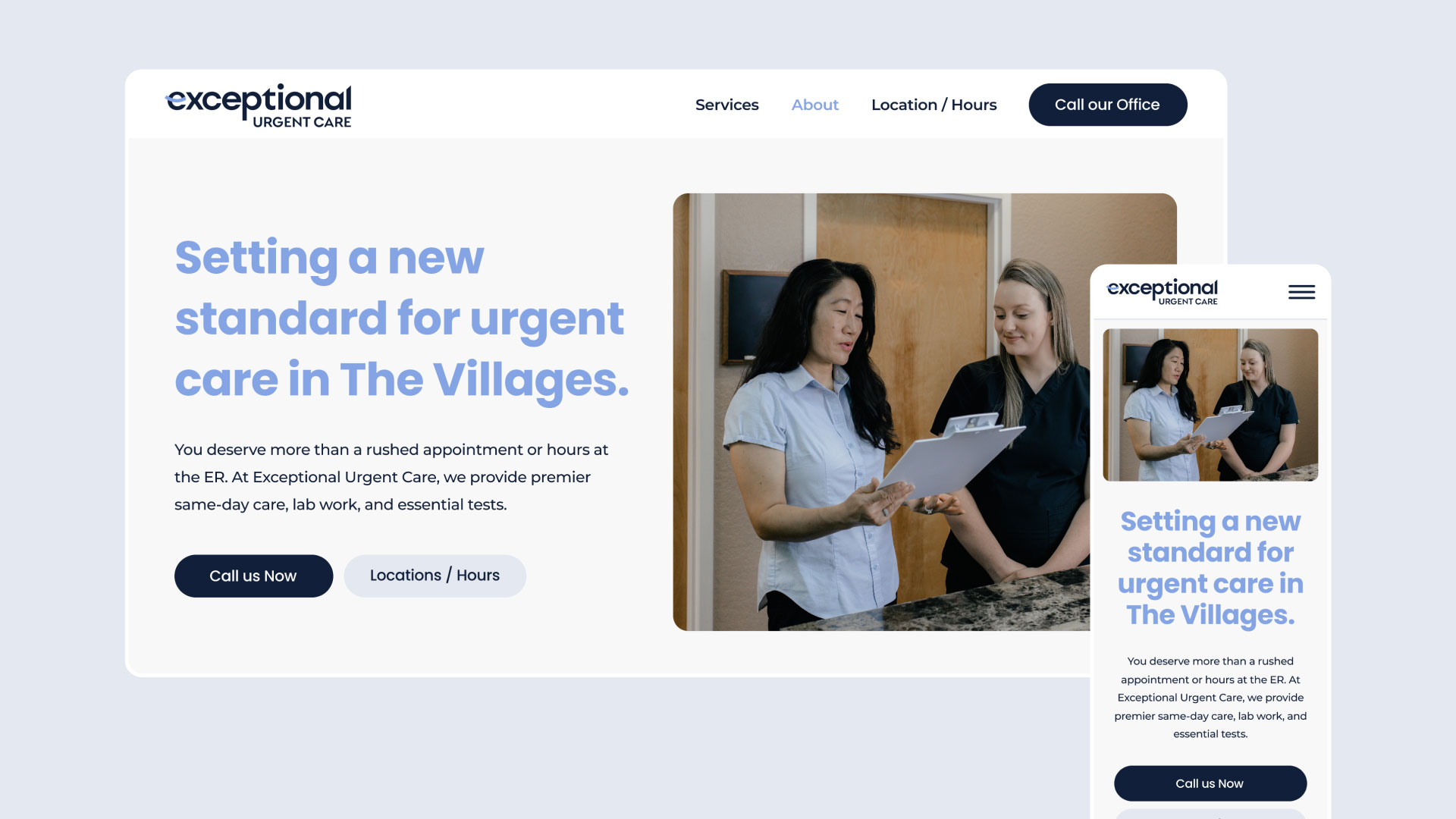
👇 Here is what makes a website responsive:
Smart Navigation:
Menus adapt seamlessly to different screen sizes for easy access
Flexible Type:
Text remains readable and properly sized (and spaced) across all devices
Adaptive Layout:
Content reorganizes beautifully from desktop to mobile views
Touch-Friendly:
On mobile devices, buttons and links are large enough and spaced well to avoid misclicks
Put Your Website to the Test
You want to hear some good news? The best way to find out if your website is user-friendly isn’t through fancy analytics or expensive software – it’s by watching real people try to use it!
Fun fact ☝️ I have used my 9-year-old son in the past to help me with this (his unfiltered feedback? Pure gold. 😂)
👇 Here’s how to run your own user test:
Find Your Test Users:
Grab a few friends or family members who aren't familiar with your industry (this is key – you want fresh eyes!)
Start with First Impressions:
Let them explore your homepage and share their thoughts out loud (make sure to take note of their initial reactions!)
Give Them Real Tasks:
Ask them to complete common actions like signing up for your newsletter or finding your services
Stay Silent:
This is the hard part! 🤐 Resist the urge to help or guide them – watching them struggle can be uncomfortable, but it's where the real learning happens
Pro Tip: The magic happens when people think out loud. If your testers get quiet, gently remind them to share what's going through their minds as they navigate.
Ready For a User-Friendly Website?
Ready to take the guesswork out of your website’s performance? My Website Audit Service does just that.
For $300, I’ll thoroughly evaluate your site and pinpoint the areas that need improvement – from usability to accessibility and everything in between. The best part? If you book a website project afterward, the audit fee is applied to your total cost.
Don’t let a frustrating user experience cost you clients. Let’s uncover your website’s full potential.
About the Author


Emma Hubanks is the founder + Web Design Strategist at Luma Liz, a web design studio transforming how established service providers show up online. With 11 years of experience in marketing, creative direction, and strategic design, she combines the proven StoryBrand framework with premium web design to help businesses become unforgettable in their markets.

